culture
Interview with Valentina Cameranesi
condividi
Share icone
Valentina Cameranesi | ph. Piergiorgio Sorgetti
Valentina Cameranesi Sgroi, an independent designer, creative director, and set designer, explores the poetic dimension of decorative objects in her personal research. Her work embraces a wide range of artisanal techniques, reinterpreted through a contemporary lens and drawing on cultural references from cinema to fashion, creating objects imbued with a strange and mysterious beauty. For Incalmi, Cameranesi Sgroi has designed Allegretto, a project presented exclusively at EDIT Napoli 2025.
You are presenting Allegretto at EDIT Napoli. Can you tell us what it is?

Allegretto is a project I developed in collaboration with Incalmi, a reinterpretation of their modular system Maniera. The system consists of a grid, a potentially infinite, extendable, and removable structure, over which a cladding is applied. My work focused precisely on this: how to alter, distort, and manipulate it. Completing the enamelled copper wall are small objects of varying sizes, materials, and proportions, exploring the theme of colour, which lies at the heart of this project. It’s as if each colour had its own preferred form, its own preferred note – hence the musical reference.

It’s a signature interpretation.

Yes. The Maniera system is based on an almost engineering-like concept, and my role was to give it a form that would maximise its customisation potential – today it’s me interpreting it, but tomorrow it could be another designer, another architect. Anyone can decide how to work on the grid, as if it were a musical staff on which anyone can write their own composition.
Valentina Cameranesi during one of the design phases | ph. Piergiorgio Sorgetti
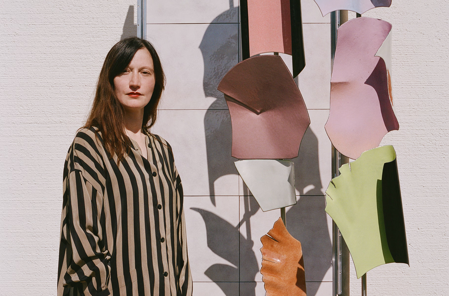
The transition from Maniera to Allegretto, the deformation you mention, happens right before the viewer’s eyes.

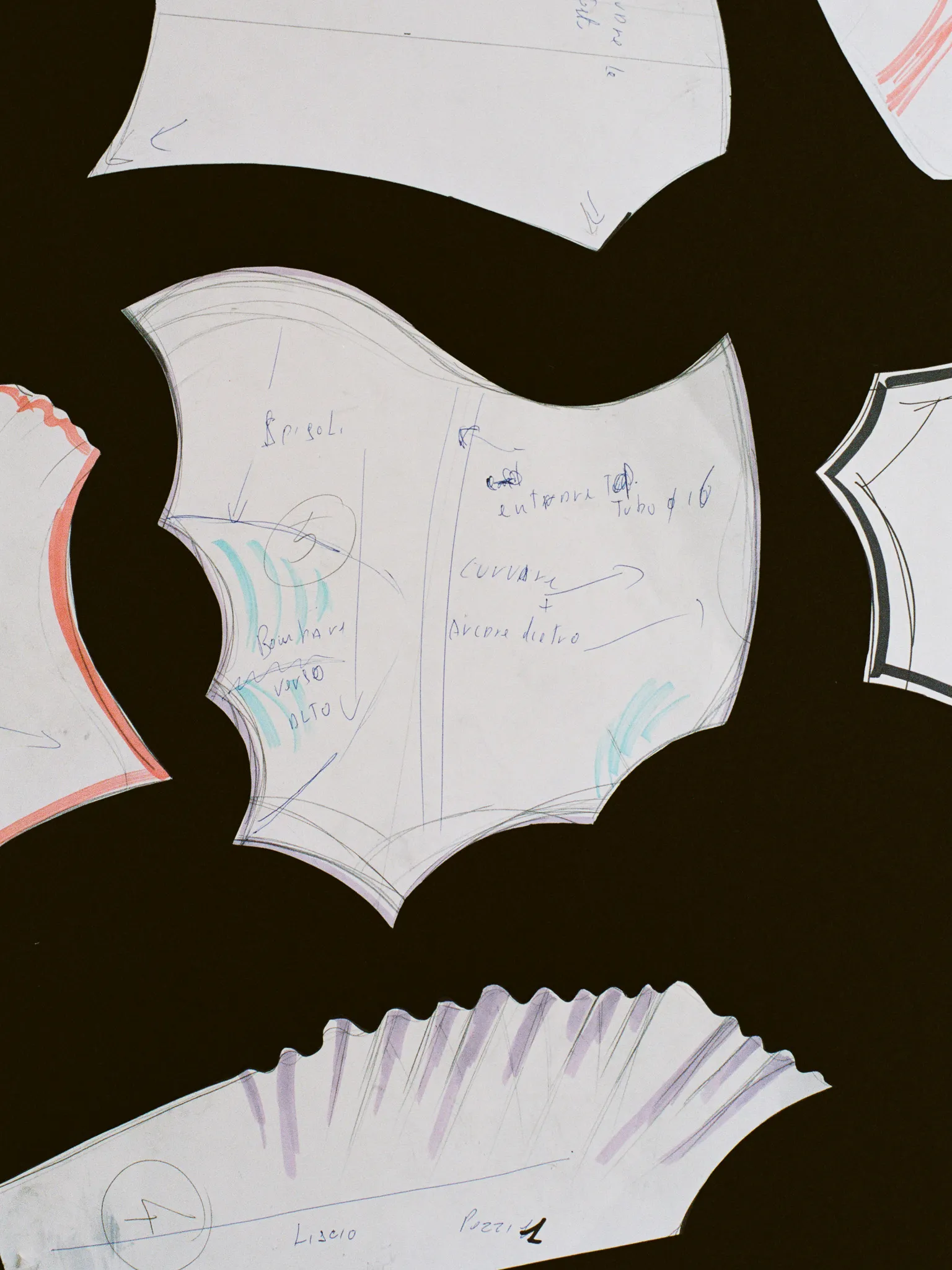
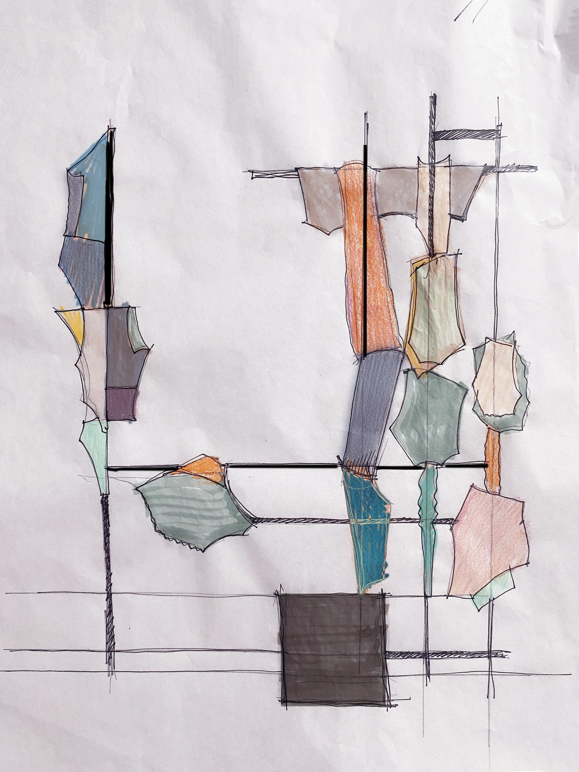
Exactly. Yes, exactly, we start with a wall that is 100% Maniera, and slowly the cladding begins to transform, as if it were being stripped, shifting, opening. There is a sense of unity, the material is the same, the approach shared, but at a certain point the lines are no longer straight, and only broken curves remain, like a treble clef, or some Baroque church plans. This gives the wall movement, not mechanical but poetic, heightened by the play of light on the surface. During the process, I described the wall as ‘sensual’, where sensuality comes from the material, from engaging all the senses, even though, as in all contemporary projects, the visual impact remains dominant.

How did the collaboration between you and Incalmi begin?

We met a few years ago while I was developing projects for an exhibition at the Jacqueline Sullivan Gallery in New York. I have a deep admiration for Fausto Melotti’s ceramic work, and I’m fascinated by the technique of enamel on copper, so I had the idea of combining the two. During my research, I discovered that Incalmi’s workshop was the only one working with this technique. We began collaborating, especially on my own projects. Later, it was they who invited me to work on this one.

How important was the location you were assigned, the former Santissima military hospital, in defining the project?

Very important. Starting from the space itself, I also envisioned the project’s visual impact, which is a natural approach in set design, one of my specialities. Having coordinates and constraints always helps me a lot: in this case, I chose to work around the two windows, cladding the space so as to incorporate the external landscape into the interior. It wasn’t conceived as a purely conceptual gesture; I simply worked on a corner of the room as if it were a section of a minimal space –minimal in the sense of reduced, not in the sense of minimalism.
Detail of one of the decorative elements created for Allegretto | ph. Piergiorgio Sorgetti
Detail of the enamel sheet on copper for Allegretto | ph. Piergiorgio Sorgetti
Would you say this approach stems from the fact that you encompass multiple roles – that of art director, designer, and set designer?

Definitely. When working on sets, installations, or even photographic images, I immediately think about the overall visual impact: for me, an object is never just an object, it’s an object in a context. Context, therefore, is essential from a design perspective.

In your design materials, you state that the idea of imperfection is a necessary condition: what does this mean, and how does it translate in practice?

It means that what might seem like problems aren’t problems to me. At first, artisans would sometimes say, ‘This didn’t come out well,’ and I’d reply, ‘It’s beautiful, let’s keep it that way.’ It became a way of discovering each other. Much of this stems from the nature of enamel on copper, how it behaves chemically: understanding this together felt natural.

Because with enamel on copper, you don’t know what has happened until the object comes out of the kiln. Yet there are still those who want precise design or an exact shade.

I think especially now, when we can potentially have total control over everything, the beauty lies precisely in acceptance, in the ability to see things differently. We are too accustomed to designing and planning everything, but including mistakes and the unexpected is necessary – even in life.
Allegretto draft by Valentina Cameranesi | ph. Piergiorgio Sorgetti
Allegretto draft | Valentina Cameranesi
Allegretto is made up of many different shapes. How did they come about?

The Maniera system is a grid – a square or a rectangle. I was interested in reshaping it, as if the elements were being stirred by the wind. In the design phase, I work a lot with cardboard, and I liked the idea of recreating the shape of a sheet of paper left in the sun, crumpled, folding in on itself, becoming three-dimensional. For this reason, I see it less as a fixed shape and more as a concept expressed through various forms.

You often work on the contrast between rough and finished: what importance do contrasts have?

They are absolutely essential: for me, beauty cannot exist without ugliness. What defines beauty? What defines ugliness? Often it is the tension between the two that is most inspiring, – and sometimes those roles can be reversed, so that what appears ugly can become beautiful depending on the context. This is a guiding principle for me. In this case, the most striking contrast lies in the aluminium grid – rigid, imposing – set against the light, playful aesthetic of shapes unfolding across space. There is also contrast in the colour choices, which are never simply just ‘right’. For example, black sits alongside green. I noticed that I had used a great deal of black, perhaps because I wanted to create an almost reverse trompe-l’œil effect, transforming something three-dimensional into what feels like a drawn outline, a two-dimensional form.

These contrasts often also become material: natural-artificial, hard-soft… Is this element present in Allegretto as well?

Yes, of course. There are material contrasts here too, most notably between the sophisticated, rich enamelled copper and the bare aluminium structure: two distant worlds, one decorative and one technical. The metal wall is completed by a small tatami, which suggests softness, rest, and quiet, while also adding formal interest as a horizontal element within a vast vertical forest.
Some of the enamel on copper elements that make up Allegretto | ph. Piergiorgio Sorgetti
How did you come to use these colours?

It was quick and spontaneous. I work with colours with great serenity – I have a deep passion for fabrics, I draw with coloured pencils, and I’m not afraid to use colour. There are, indeed, certain shades that are very much my own, which I always use, and this time I tried to push myself to use others, such as black, or acidic tones, because I like how they appear on enamel. Colour changes greatly depending on the material. For example, red is a colour with which I have a difficult relationship. So I worked with reds that are never truly red – a peach red, a cherry red – turning them into details, accents. But it is such an instinctive process that, not only can I not explain it, I can hardly even understand it myself. Moreover, for some reason, in my mind Allegretto and Arlecchino carry almost the same meaning (playful).

For you, objects are never just objects; they are expressive presences that evoke worlds. In Allegretto, you included a sample book, a fake lipstick, a small vase, and the minimalist tatami-inspired bed you mentioned earlier. What was your universe of reference?

I interpreted this vertical wall as a world, a minimal, reduced world, yet one embellished with small objects you can touch and pick up. I liked the idea of creating a space that was transitory but not anonymous. Like a hotel room, but not in the literal sense of its intended use, rather in the sense of a space that is yours for a moment, where you can keep your makeup and clothes, your memories of the past and visions of the future. I wanted to keep everything deliberately abstract, so as to leave the viewer free to imagine how it might change over time.
Copper sheet enamelled with fire | ph. Piergiorgio Sorgetti
Sbilenco cabinet hinges | ph. Piergiorgio Sorgetti